What about black and white? Light and shadow contrast. Chapter 3.

Published by

on

In chapter 1, chapter 2 and Chapter 3 of this series of posts I showed photographs that do not lend themselves well to black and white conversion because they rely on colors and saturation for the separation of the main elements in the composition.

The point I wanted to make is that not all photographs will be improved by black and white conversion, and it helps the photographer to know which ones work and which ones don’t, if black and white is the goal. After all, who wants to waste a precious photography outing?

One desirable characteristic to look for in compositions meant for black and white conversion is high-contrast and deep shadows.

Although strong shadows is not really a characteristic of what I see as my “style”, I do have some older photos to show below. Uploading those images in color would not make sense to me, since I find the black and white versions more appealing.

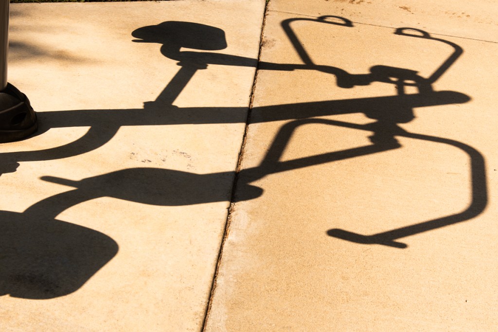
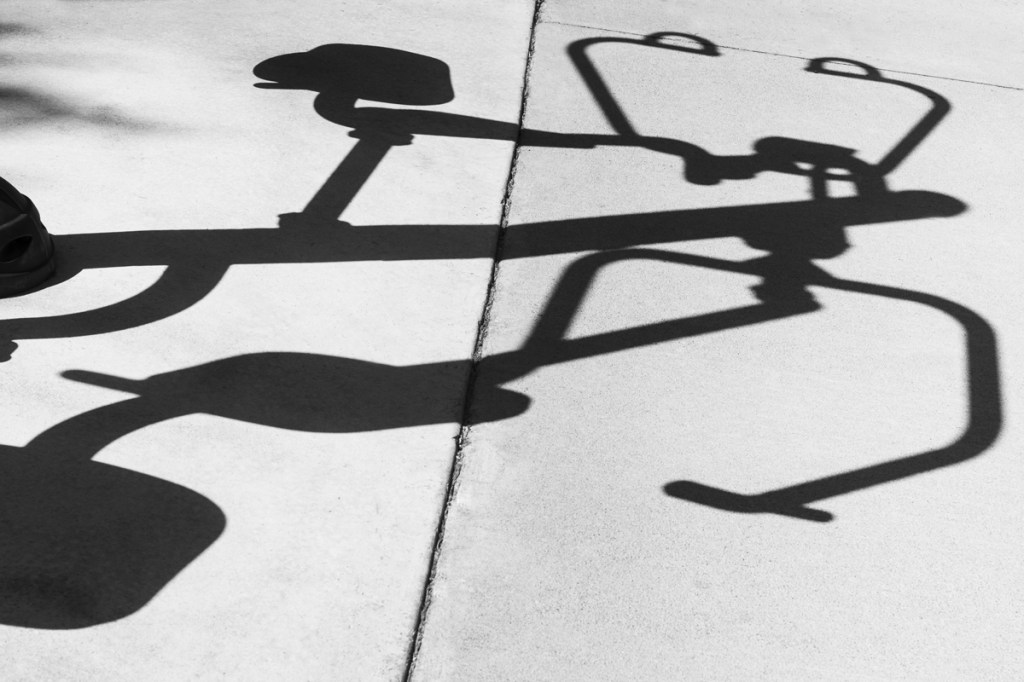
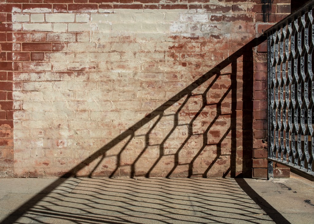
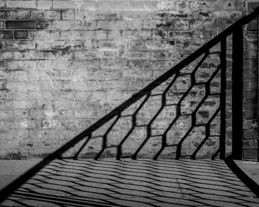
Question for my followers: besides the presence of high contrast between light and shadow, can you identify other elements in the above photographs that make them obvious candidates for black and white?

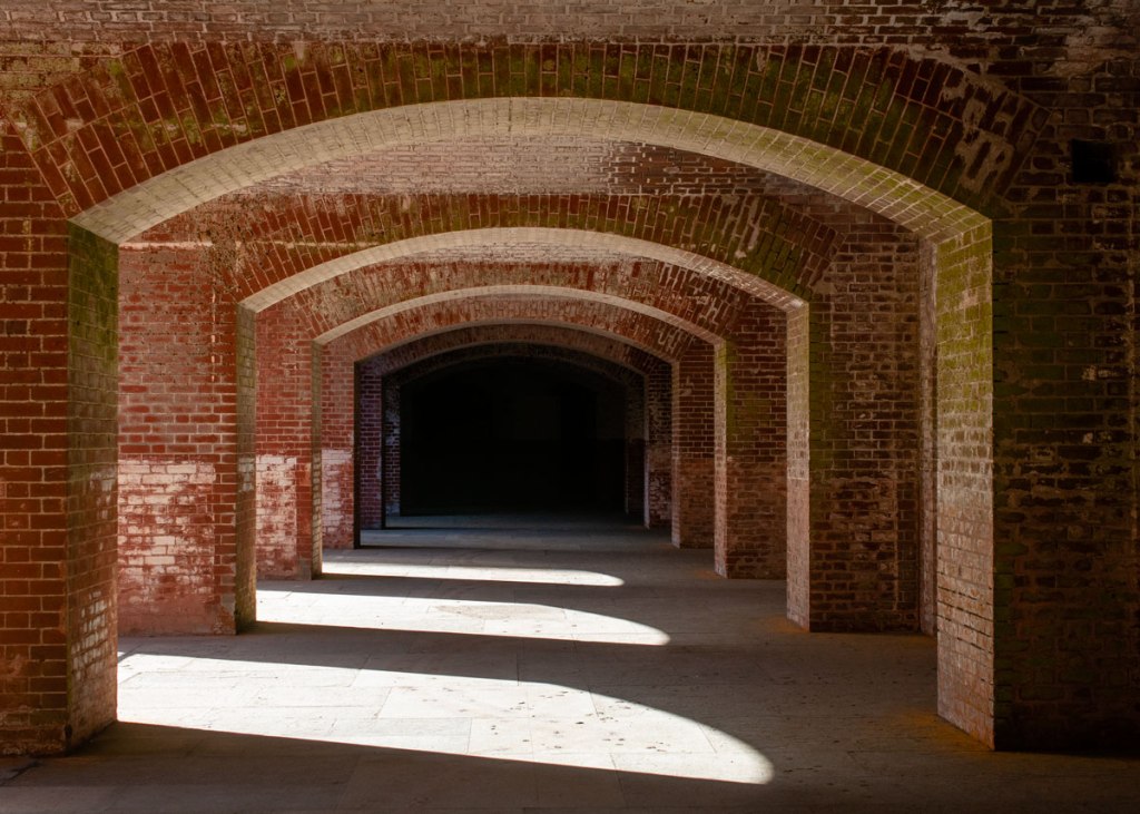
The FEATURED PHOTOGRAPH was taken at Fort Point, SF (40mm, f/8, 1/100s, ISO 400) in 2018. It was a nice chili and cloudly morning in San Francisco. A friend had failed taking long exposure shots of the ocean with the Golden Gate Bridge, the wind was fierce. Inside the fort was pleasant, shielded from the wind. Suddenly the sun came out and upon seeing these shadows, I took the photo. Tunnel vision, 2028, was featured at Gallery 625 in Woodland, CA, as part of the exhibit, Light Shadow, Reflection in 2020.

———————————————

Wall Art Botanical Images

Wall Art Photography projects

Wall Art Landscapes

________________________________

20 responses to “What about black and white? Light and shadow contrast. Chapter 3.”

  1. WritingfromtheheartwithBrian Avatar

    Thanks Alessandra, I love the discussion on black-and-white versus color. I’m always fascinated by the choices to go with each. In my own photographs, I find that I search as you mention for high contrast for B&W. I think too that some topics just work better in B&W. A number of years ago, a coworker and I did a series on the decision to close a federal base, it just seemed to work best without the color. Love these images. Thanks for sharing.

    Like

    1. Alessandra Chaves Avatar

      Thank you. High contrast often looks good in b&w, but not in color.

      Like

      1. Lakshmi Bhat Avatar

        The black and white photos have more appeal. Lovely photos.

        Liked by 1 person

  2. Anne Sandler Avatar

    To answer your question: repetitive patterns. Great photos and post.

    Liked by 1 person

    1. Alessandra Chaves Avatar

      That’s a good observation, Anne.

      Like

      1. Anne Sandler Avatar

        😊

        Like

  3. Steve Schwartzman Avatar

    I agree that high-contrast pictures with patterns and shadows generally lend themselves to black-and-white conversion. That said, the original color versions of these three photographs still appeal to me as well.

    Like

    1. Alessandra Chaves Avatar

      Thy are all monochromatic images after all. A different tone but monochromatic.

      Like

      1. Steve Schwartzman Avatar

        Good point.

        Like

  4. petespringerauthor Avatar
    petespringerauthor

    Each of the three black-and-white photos appeals more to me, especially the last one. I’m not a photographer, but it seems to me that things with unusual angles work well in black and white.

    Liked by 1 person

    1. Alessandra Chaves Avatar

      strong graphic elements, which include unusual angles, often work well.

      Liked by 1 person

  5. shoreacres Avatar

    While I prefer the first in the series of three images as a black and white, for me it’s a matter of eliminating that sickly yellow, and better showing the crispness of the shadow. With the next two, I much prefer the sepia versions. Both ‘Shadow Gate’ and ‘Tunnel Vision’ seem more inviting: less flat, with clearer detail.

    Liked by 1 person

    1. Alessandra Chaves Avatar

      It’s not really a sepia version, but the original color. Thanks for your input! People have different tastes…

      Liked by 1 person

  6. tierneycreates: a fusion of textiles and smiles Avatar

    I love seeing the contrasts between the in color photos vs. the B&W photos – amazing! The Tunnel Vision in B&W is so much for mysterious and foreboding that the other version. Wonderful images!

    Liked by 1 person

    1. Alessandra Chaves Avatar

      Thank you.

      Liked by 1 person

  7. howg2211 Avatar
    howg2211

    Great photos. As others have said, strong graphic patterns make for nice black and white images. Combine that with high contrast as you have done in the examples and you’ve got some winners!

    Like

    1. Alessandra Chaves Avatar

      Thanks for your input!

      Like

  8. christianmeermann Avatar

    I have been working in black & white exclusively since 2016. It has been a constant learning process … and I am still learning. And it pays off: Quite often, when after months or years I return to an old image I couldn’t get to work in in black&white back then, I happen to find the right combination.
    This is why I find the question misleading because it implies that a photo has to meet certain conditions or criteria to function well in black&white. In my mind, however, every image has the potential to work well in black&white. We only have to find the way to make it work… to find the one combination of black&white tones and contrast values the image needs. Of course, for some photos this combination is easier to find than for others, but I strongly believe there is one for every photograph.

    Liked by 1 person

    1. Alessandra Chaves Avatar

      Interesting point! Although I don’t agree that there is a potential in every photo, it’s possible that there is a potential in more photos than I give a chance too. Thanks for your input.

      Liked by 1 person

  9. What about black and white? Drama. Chapter 4. – It is all about the light Avatar

    […] they rely on colors and saturation for the separation of the main elements in the composition. In chapter 3, I presented a series of photos that are characterized by high contrast between shadow and light, […]

    Like

Leave a reply to What about black and white? Drama. Chapter 4. – It is all about the light Cancel reply

Discover more from It is all about the light

Subscribe now to keep reading and get access to the full archive.

Continue reading