In chapter 1 and chapter 2 of this series of posts I showed photographs that do not lend themselves well to black and white conversion because they rely on colors and saturation for the separation of the main elements in the composition. Those were landscape photos.
In this post, I give an example in botanical photography. The point I want to reaffirm is that not all photographs will be improved by getting rid of color, and it helps the photographer to know which ones work and which ones don’t, if black and white is the goal. After all, who wants to waste a precious photography outing? Well, that’s what I did a couple of weeks ago.
The “Winter Tulip” photography project
At least some of you know that I have a photography project on tulips, “Winter Tulip”. All my photos in that project but one were taken at home against a simple background, using controlled artificial light. In that series, I emphasize the shape, form and light of my subjects. Despite the usual lack of contrast typical of tulips, I have succeeded converting my photos to black and white using studio techniques.
The visit to Christal Hermitage Gardens
On April 22, 2023, I had the pleasure to visit Christal Hermitage Gardens in Nevada County, CA, for the first time. This is a famous location for tulip flower viewing, which attracts many tourists. This year, they had a few “photographers’ walks” after hours, and I joined one at 5:30 pm.
Christal Hermitage, I thought, would allow me to test my skills in the field and maybe add a photo or two to “Winter Tulip”. I was right about the first part; my skills were tested.
First and foremost, I must say that I could have made the place into a little studio if I had carried a tripod and a strobe light, and perhaps a few more tools like a diffuser, a reflector and a small dark background. However, I wanted to see if I could take good photos with the natural light in the afternoon.
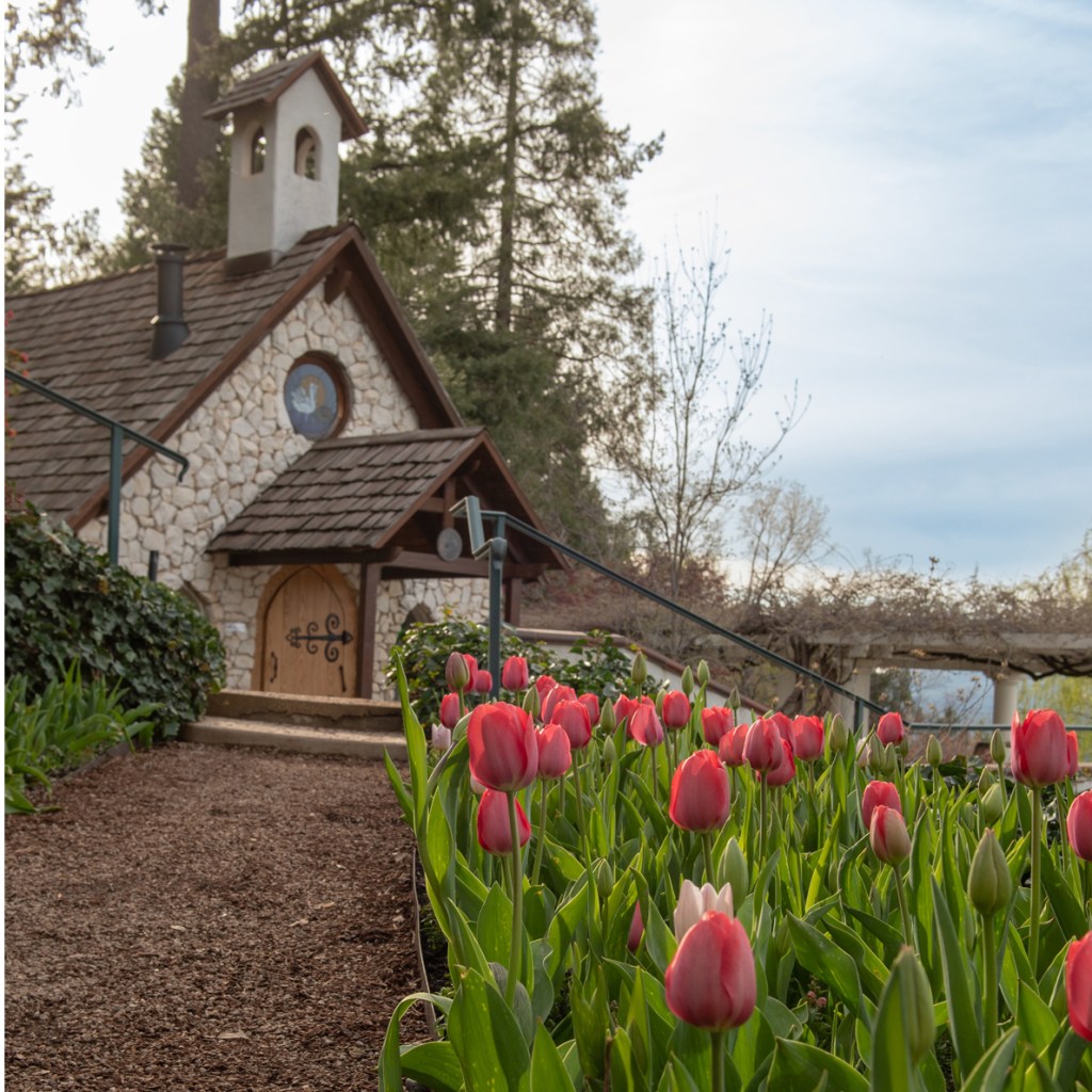
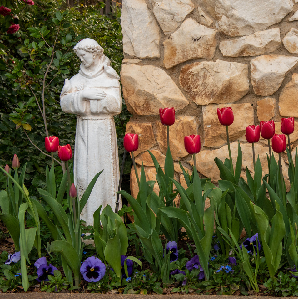
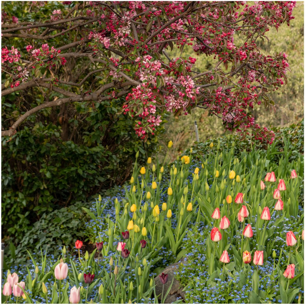
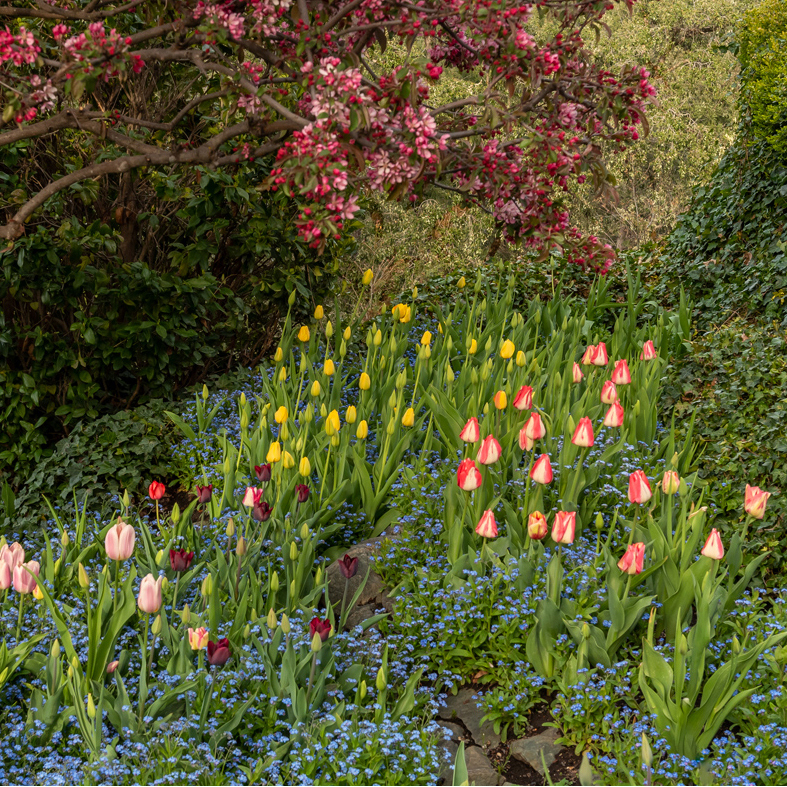
Below are some snapshots of the location, to give you an idea of about how the place looks like.
I took two cameras with me, each with one lens: the 24-70mm f/2.8 and the 105mm f/2.8 macro. It was a good choice of lenses, although I ended up using the macro way more than I used the zoom.
The light was beautiful. For about an hour, it hit the tulips at an angle, causing them to glow. There were many buds, which in my opinion offer interesting “poses” to the observant photographer. The light was also very pretty on them, directional, soft.
My results: the tulip harvest
When I got home and started trying to convert the photos to black and white, I realized that separation and contrast were very difficult to achieve. Furthermore, because there was a breeze and I did not have a tripod and flash with me, I had to keep my lens open. I also had to use a wide aperture because the flowers were very close to each other (see pictures of garden above). A shallow depth of field, particularly when one cannot control the light, is often not flattering on black and white botanicals, resulting in lots of highlights and bright areas away from where the viewer’s eyes are supposed to go. Most photographs in “Winter Tulip” were taken with narrow apertures (f/16-f/22).
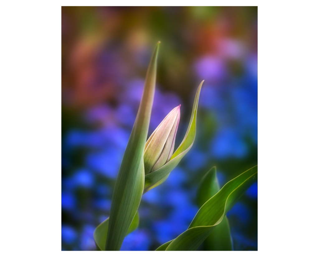
I took a few frames that I liked, my favorite of which is the FEATURED PHOTOGRAPH (f/3, 1/200 ISO 200 at 105 mm). It is a typical image that needs to be left in color, as many others I took there. I have baptized it “TULIP STRETCH, 2023”. Below, note how the photo loses some of it’s appeal when converted to black and white:
Above, most of the problem with the monochrome version of the FEATURED PHOTOGRAPH is the distracting background. In the color version, it seems to complement the flower more than distract. Furthermore, because of the background containing some of the colors present in the tulip, I was unable to enhance contrast on the flower (on a later chapter, I will write in more detail about the conversion process).
—————————————————————
________________________________

Leave a comment