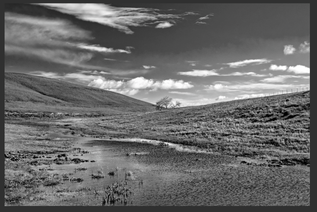
This is my second of a series of short posts about black and white photography. Previously, I advanced that it is important to recognize which types of compositions work, and which ones don’t work, before clicking the shutter. I posted the photograph below and asked my followers if they think that it would work in black and white, and why they think so.

Before I discuss the answers, I must stress that “beauty is in the eye of the beholder” . If you like a picture, any picture, and would like to have it hung on your wall to look at it every day, then it’s a good picture. From the viewpoint of personal aesthetics, there is no “right” or “wrong” answer. However, I did not ask my readers if they like or don’t like a black and white version of my photograph. My question was if they think that “getting rid of color would detract from the image and make it weaker, less appealing“.
Summarizing the answers
Most respondents answered that the image would be better left in color, because the tones are similar, and the similarity in tones would make contrast, and thus separation (between lines, elements) difficult. However, at least some respondents seemed to believe that, in post processing, something could be done to enhance contrast.
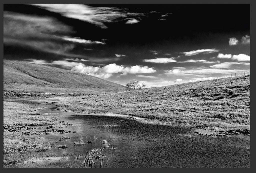
Let’s look at the conversions
I uploaded the image to Topaz Black and White to test some possibilities. This is not how I do my own conversion to black and white, but it will facilitate standardizing the discussion. The program allows the user to emulate the use of colored lens filters to convert a color image to black and white. If you are not familiar with the use of colored lens filters in black and white photography, there is a link explaining it here.
Basically, a filter will lighten up its own color, and darken the portions of the image that do not have that color.
Below are examples of conversion applying color filters in post-processing, using Topaz software (click on each image to obtain an enlargement):


Conclusion
I agree with my respondents who wrote that the tones in the image are too close together, which makes it difficult to separate the subject and leading lines. Eliminating color takes from and weakens the impact of the image being discussed.
Of course there is often something I can do in post-processing to make an image look a little better, but “I can” does not mean “I should.” I rather concentrate on images that naturally lend themselves to a black and white presentation, and which will be enhanced by it without my having to spend hours on the computer trying to improve them.
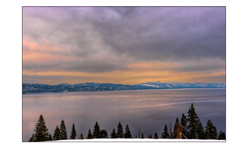
The FEATURED IMAGE
Similarly to the case discussed in this post, the FEATURED IMAGE (f/10, 1/125s, ISO 100) gets most of its interest from the saturation of its colors, and I would not waste my time converting it to black and white. I took it on March 17 of this year as part of a snowshoeing expedition to witness the sunset over Lake Tahoe. Because of an approaching storm, there wasn’t much of a sunset, but a hint of color was present and was captured by my camera. The view was perfectly splendid that evening, to give closure to a lovely day in the mountains.
Continues in Chapter 3…
______________________________
Wall Art landscapes and miscellaneous
________________________________

Leave a reply to What about black and white? Chapter 5- conversion – It is all about the light Cancel reply