It has been a while since I last wrote a chapter about black and white.
In chapter 1, chapter 2, Chapter 3 and Chapter 4 of this series of posts I wrote about the types of compositions that lend themselves naturally to a pleasing black and white photograph. I concluded that, in general, those images are simple from a compositional point of view, do not rely on color for the separation of their main elements, are rich in geometrical lines, angles, repetitive patterns and/or texture. I also wrote that drama can be an essential part of the appeal of a black and white photograph. In this Chapter 5, I wrote about converting color digital files to black and white and laid out three common methods for achieving this transformation.
In this chapter, I elaborate on the issue of separation and how to work on a black and white image to achieve that
The problem
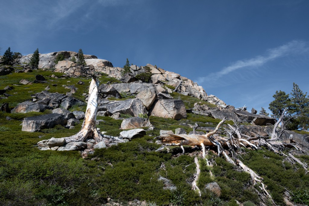
One of the greatest challenges in black and white landscape photography is achieving adequate separation between the elements of a scene. In color photography, different hues naturally distinguish one object from another. A green meadow, a blue sky, and a red rock formation remain visually distinct even if their brightness levels are similar. In black and white, however, color disappears and everything is translated into shades of gray. Objects that were once clearly separated by color can merge into a single tone, resulting in a flat and confusing image. Look at the image below, in color, to see how the latter helps to achieve separation.
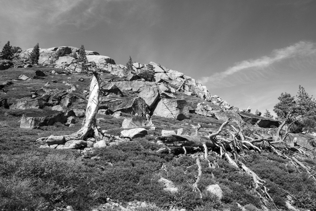
If we simply convert that image to monochrome, the resulting image can look really flat and it is difficult to tell what’s what because the tones are very similar.
If you encounter a more complex landscape and still want to create a black and white image without simplifying, the only course of action is to try to separate the tones as much as possible. And this is how I achieve it:
I use Photoshop in my post processing work. I edit my RAW images in color in Camera Raw, enhancing contrast and hues, and save the file in Photoshop format (psd) for black and white conversion.
I then create a black and white layer, and choose “Custom” from the drop-down presets menu. This allows me to manipulate the color sliders until I obtain the result that is consistent with my vision. This method gives me the greatest amount of control over my conversions, and I can always come back to the color file and edit my b&w conversion. Those who use Lightroom can manipulate the custom preset directly by moving the color sliders.
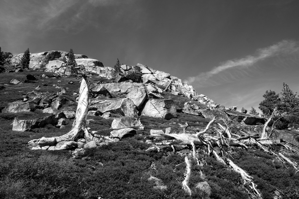
See below how the tones begin to separate: the sky, the rocks, the grass and the ghost tree trunks.
The last step is selective dodging and burning. I use those tools to enhance the separation between the elements. In the case of the FEATURED IMAGE (repeated below), I dodged the trees to be the brightest elements in the photo; and burned the rocks to look slightly darker than the trees.
The photo was taken from the PCT trail overlooking Donner Lake in California’s Sierra Nevada. If you want to see another photo taken there, look at my previous post.
Let me know what you think and if this chapter has been helpful to you.
______________________________
Wall Art landscapes and miscellaneous
________________________________

Leave a comment