Introduction
Some things are as they are, not was we want them to be. This assertion may sound trivial, but reality does have boundaries.
We are biologically programmed to see in color, to use color to discriminate among things, to search for food, to identify dangers. We are biologically attracted to color. And when it comes to art appreciation at the most basic level, biology matters.
Because I am a biologist, I understand the importance of biology. But because I am also an artist, I often ignore biology for the sake of self-expression.
I spend a lot of time promoting my monochromatic images, but my images that get likes and also the ones that get sold more consistently are in color. This is not something that can be changed. Fancy that. It is what it is.
If you want to make some money selling prints though social media, try to offer images that play a crucial role in capturing attention and engagement. With platforms like Instagram, Pinterest, and Facebook becoming visual playgrounds, understanding what types of images garner the most appreciation can be pivotal. Simple monochrome photos often struggle to gain traction. Let’s dive into a few elements that make certain images more likable and explore why simplicity in monochrome might not always hit the mark.
1. Bright and Colorful Images
Why They Work:
- Eye-Catching: Bright colors naturally draw the eye, making users stop scrolling to take a second look.
- Emotional Impact: Colors can evoke emotions. For example, blue can be calming, red can be exciting, and yellow can be uplifting.
- Visual Interest: A diverse color palette can make an image more visually interesting and dynamic.
Examples:
- Vibrant landscapes with vivid sunsets.

Click on the image above to see a larger version or purchase a print
- Colorful street art.
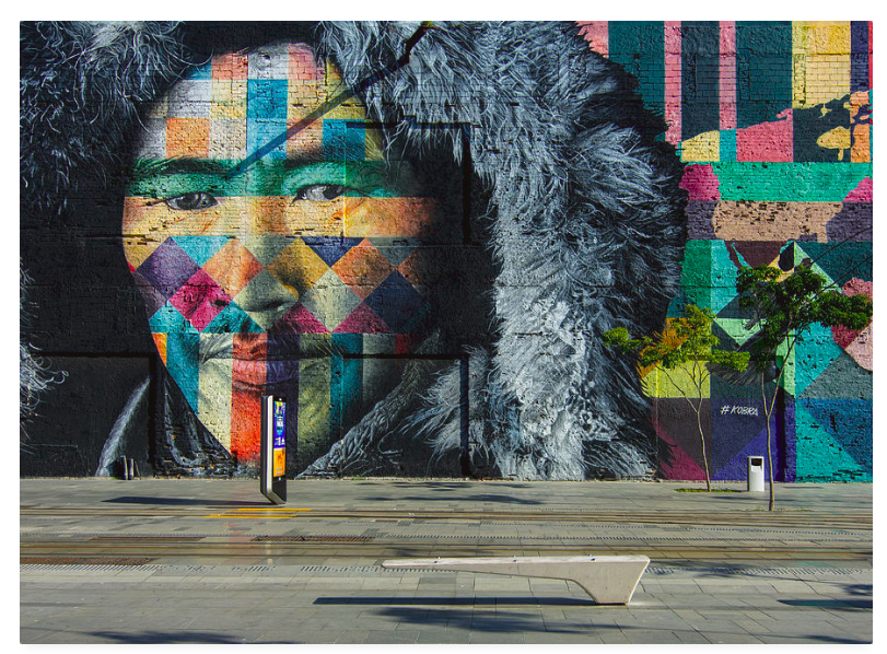
Click on the image to see a larger version or purchase a print
- Macro shots of nature.
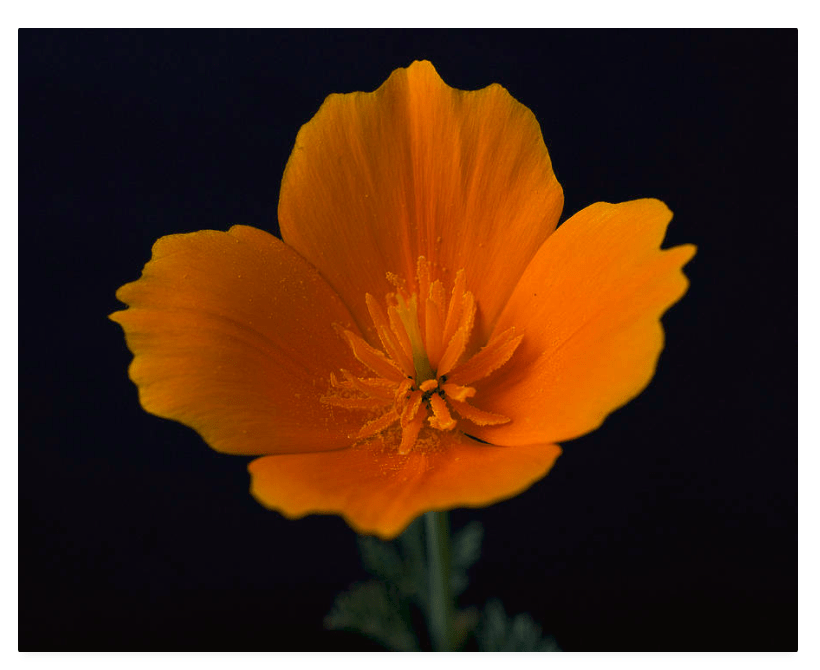
Click on the image above to see a larger version or purchase a print
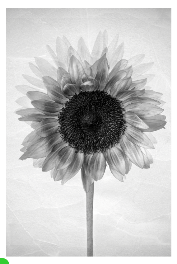
Monochrome Images Often Don’t Get as much attention
Lack of Immediate Impact:
- Monochrome images, especially those in shades of grey, may not stand out in a sea of colorful, vibrant photos. They often lack the immediate visual impact needed to catch a viewer’s eye during a quick scroll.
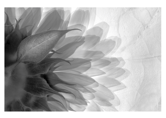
Click on the image above to see a larger version or purchase a print
Perception of Simplicity:
- Simple images in monochrome can sometimes be perceived as lacking effort or creativity. In a social media landscape where users are bombarded with visually complex and stimulating content, simplicity can be overlooked.
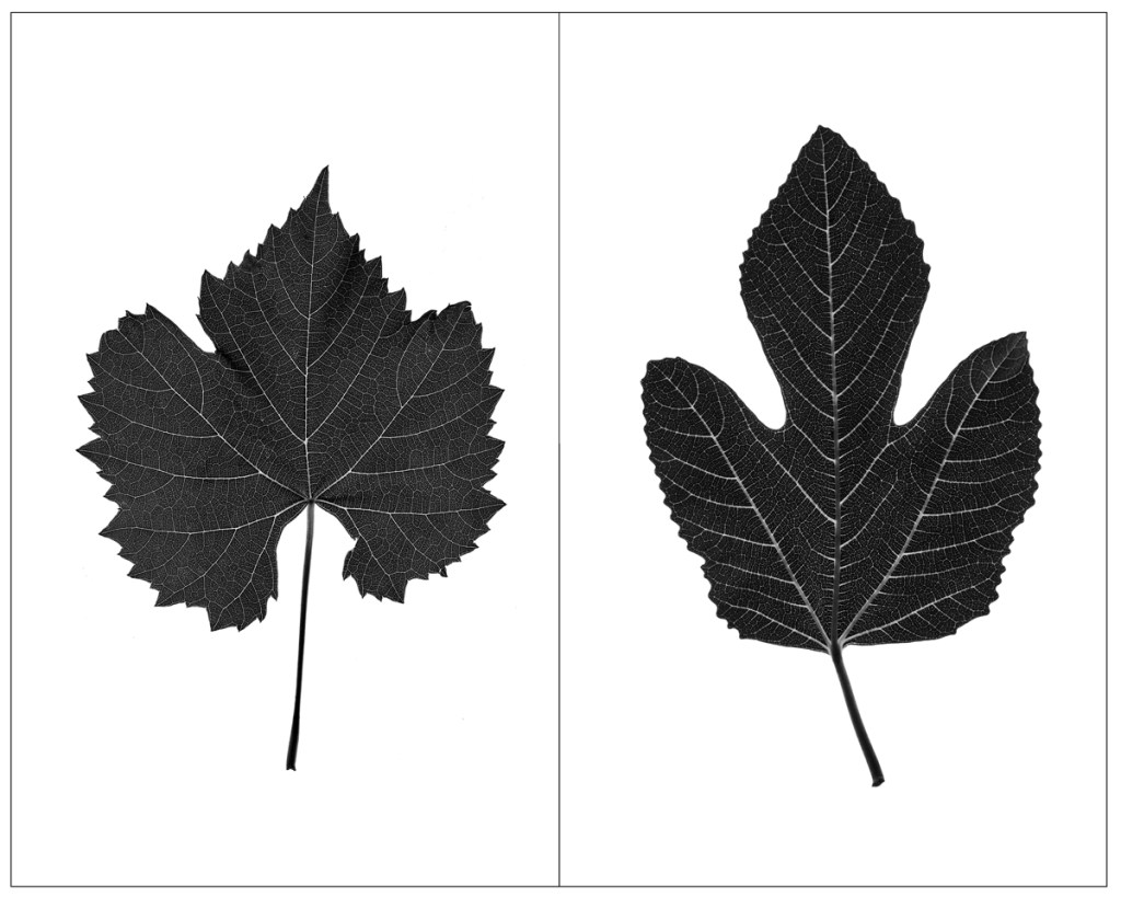
Click on the image above to see a larger version or to purchase a print.
Emotional Resonance:
- While monochrome photography can be powerful and evocative, it requires a more discerning eye and a deeper appreciation. Casual viewers may not always connect emotionally with such images, leading to less engagement.
Click on the image above to see a larger version or to purchase a print
Immediate connection with a place
I while ago I posted in this blog a photograph of the Golden Gate Bridge from Baker beach in monochrome. The image that i more likely to sell online, however, is it’s color counterpart. Why? Well, one reason is, it stands out more in social media and another is, it’s easier to make an immediate connection with the place if in color.

Golden Gate Bridge from Baker Beach- Click on the image above to see a larger version or to purchase a print.
The minimastic style in a visually saturated environment
- The minimalistic style, often associated with monochrome photography, can be less engaging. These images can blend into the background, especially on platforms teeming with vibrant visuals.
Click on the image above to see a larger version or to purchase a print
Conclusion
We are biologically programmed to see in color, to use color to discriminate among things, to search for food, to identify dangers. We are biologically attracted to color. In the dynamic and competitive arena of social media, images that are bright, colorful, and saturated, tend to capture more attention and likes. While simple monochrome images possess their own aesthetic value, which can be more thoroughly appreciated in quiet galleries and solo shows, they often fall short in the fast-paced, visually saturated environment of social media. Understanding these dynamics can help creators tailor their content to better resonate with their audience and achieve greater engagement.
______________________________
Wall Art landscapes and miscellaneous
________________________________

Leave a reply to tierneycreates: a fusion of textiles and smiles Cancel reply