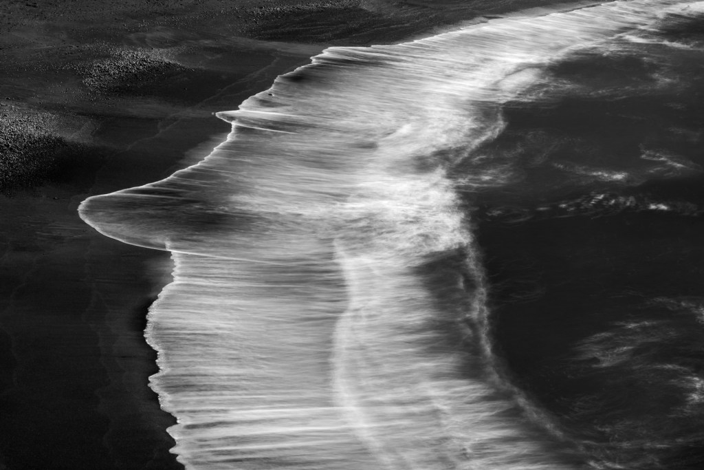
On January 09, I came home with many pictures from the Fort Ross expedition. At first, I wanted to delete all of them: the camera-processed jpgs looked lifeless and uninteresting. As I started processing the raw files, however, I began to like a few, two of which I have already posted on this blog: Beyond Fort Ross and My Mood of the Ocean. The one above is, in my opinion, a nice abstract addition to that series.
Unlike the photographers who are proud of their “in camera” photographic accomplishments and process their images with “no edits” and only small adjustments, I like to work more consistently on my photos in post-processing. The final product may take several hours of work to accomplish, and it may not look anything like I saw when I was taking the picture. As I pointed out in a previous post, developing my photographs in black and white helps to free my mind, and the viewers’, from the original scene, or from what an equivalent scene is supposed to look like. On this day, the sky was blue, the sun was out, and the ocean was unquiet.
Location: Fort Ross Cove in Sonoma County, CA, USA;
Equipment: Nikon D750, AF-S NIKKOR 24-70mm F2.8G ED, tripod, lee filters (polarizer, 6 stops Neutral Density filter, 1 stop N.D. graduated filter);
Settings: 70 mm, f/22, 10”, ISO 50;
Tips: get there early, particularly in the summer. No cell phone reception on the coast. Use a remote trigger with the filters mentioned above, experiment with different exposures. To darken the sky and bring out contrast in the ocean water, play with the blue and aqua color sliders in Photoshop. To have shapes appearing at the wave break while also capturing some texture, 6’’ to 10’’ exposures are needed.

Leave a comment